Hello and welcome to my photography blog where I have uploaded my responses to our seminar tasks and workshop tasks.
For this task, I walked around the university campus with a long lens (70 – 300mm) and took photo of anything interesting I saw in the architecture around me. I realised pretty early on that I needed to be very careful with the focus on my camera as I was using the zoom for most of my photos so they needed to be focused or they wouldn’t be very aesthetically pleasing. It was quite bright when I took the photos and as most of the buildings I was photographing had a lot of glass as part of their structure, it was hard to get the right exposure and lighting.
This week we were tasked with taking portrait photographs of strangers. Once I’d found two subjects who were willing to be photographed, the main problem I faced was getting the composition right. I struggled to find the right aperture level to get a well-lit photo so these were the first few photos I took:
I then managed to find the right aperture levels but then needed to adjust the focus. It took a few attempts as the first photos turned out very out of focus:
I eventually managed to get the right levels of both the aperture and the focus right to achieve the following photograph:

I think the focus could have been improved if I had zoomed in on the subject’s faces first but, overall, I am happy with the final photograph.
Which of the words given in the brief document have you selected, and why?
I have chosen the word “entropy” because, when I looked up the definition of the word, there wasn’t one main definition which meant there was a lot of room for personal interpretation.
What do you want to point your camera at?
I am going to use the medium of “still life” to convey my interpretation of Entropy as I enjoyed using objects to create a unique composition and I feel like using inanimate items will allow the viewer to form their own opinion of what I am trying to communicate.
Why are you interested in this subject?
I am interested in the idea of Entropy as I am interpreting it according to this definition: “entropy: lack of order or predictability; gradual decline into disorder” so I will be looking into the idea of chaos and disorder. I am going to be photographing still life as I think it could be interesting to try and convey the idea of chaos and disorder with inanimate objects.
What do you hope an audience will take from your images?
I hope the viewer will be able to form their own opinions about why I chose to photograph the objects I did in order to communicate the idea of entropy and I hope that the way I chose to portray the theme will create a lasting impact on the viewer.
What areas of research are you considering to help deepen your understanding of the subject you have chosen?
I am going to research existing still life photos in order to gain a better understanding of how to set up an aesthetic composition and use it to portray ideas. I will also research photographers who have experience with still life photography to see if they can provide any inspiration on how I am going to frame my photographs and how many objects to include.
What practitioner(s) or visual resources would you consider to have influenced you? This does not have to be photographic.
I would say that Linus Lohoff has definitely inspired me to some degree due to his use of colourful backgrounds and simple, yet effective, compositions. He successfully creates masterful photographs using single objects in each shot and bright, vibrant backgrounds.
What support or equipment might you need to achieve your goals?
I would need to find ordinary objects and come up with ways to portray the idea of chaos and disorder with stationary objects. I will need a Canon camera and an 18-55mm lens as these are both good for studio shoots.
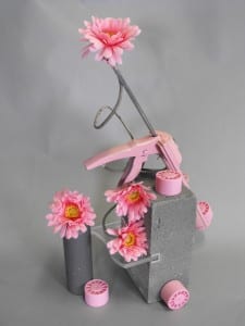
For this task, we had to use random objects and position them to make a new composition. When I first looked into the box of objects, I noticed that there were quite a few pink items which caught my attention. I decided to play around with the presentation of one main colour and so I chose a plain, grey background so as not to draw the viewer’s attention away from the pink colours in the frame. The first photo I took, I noticed that the top of the background sheet could be seen and so I adjusted the position of my camera so it couldn’t be seen in the subsequent photos. I tried to angle the lens in a way that the flowers were (mostly) facing the camera so the yellow in the flower’s centre could be seen to provide a little contrast in all of the pink. I also experimented with different levels of light to see how shadows affect the composition. The third photo below was lit from just the right side which I didn’t like as it created too much shadow in the background. I also moved the camera round to the left slightly to see how this new position would affect the overall look of the photo, however, I didn’t like this new position as it removed the 3D effect that the positioning of the objects created and made the set-up look very flat and unidimensional.
I played around with different angles and different intensities of light until I had a photograph which I was happy with. The photograph shown below is my favourite as the camera is positioned perfectly to see all the levels in the frame and the lighting is at a point where every item can be clearly seen with minimal shadows in the background, but there is not too much light that the contrasting colours lose their overall effect.
