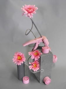
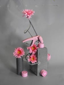
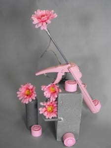
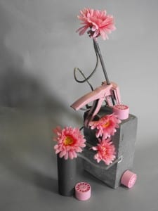
For this task, we had to use random objects and position them to make a new composition. When I first looked into the box of objects, I noticed that there were quite a few pink items which caught my attention. I decided to play around with the presentation of one main colour and so I chose a plain, grey background so as not to draw the viewer’s attention away from the pink colours in the frame. The first photo I took, I noticed that the top of the background sheet could be seen and so I adjusted the position of my camera so it couldn’t be seen in the subsequent photos. I tried to angle the lens in a way that the flowers were (mostly) facing the camera so the yellow in the flower’s centre could be seen to provide a little contrast in all of the pink. I also experimented with different levels of light to see how shadows affect the composition. The third photo below was lit from just the right side which I didn’t like as it created too much shadow in the background. I also moved the camera round to the left slightly to see how this new position would affect the overall look of the photo, however, I didn’t like this new position as it removed the 3D effect that the positioning of the objects created and made the set-up look very flat and unidimensional.
I played around with different angles and different intensities of light until I had a photograph which I was happy with. The photograph shown below is my favourite as the camera is positioned perfectly to see all the levels in the frame and the lighting is at a point where every item can be clearly seen with minimal shadows in the background, but there is not too much light that the contrasting colours lose their overall effect.


